Here is what current AI chat tools will make from a CSV if you know which words to use. Seven examples below, all from the same 25-row dataset (download it in the next section), each one a single prompt away. The cheat sheet at the end of this page is the part worth bookmarking.
The dataset
Twenty-five coconut varieties. Nine columns: variety, origin, height, weight, water content, sweetness, knock-cocco-ness, a roll-distance measurement, and a loveliness rating. Twelve of the rows are real (King Coconut, Macapuno, Vanuatu Tall and so on). Thirteen are fictional, marked with an asterisk in the origin column. The fictional rows exist because they make the patterns easier to see, and because Wibbly Twobble, Knight’s Folly, and the Spanish Inquisition Surprise are funnier to look at than yet more taxonomic accuracy.
| variety | origin | height_cm | weight_g | water_ml | sweetness | lovely_ness |
|---|---|---|---|---|---|---|
| King Coconut | Sri Lanka | 18 | 890 | 320 | 7.2 | 8.1 |
| Macapuno | Philippines | 22 | 1340 | 180 | 9.1 | 9.4 |
| West Coast Tall | Kerala (India) | 26 | 1620 | 420 | 6.4 | 7.6 |
| Wibbly Twobble | Unknown* | 11 | 410 | 560 | 2.1 | 9.8 |
| Knight’s Folly | Camelot Outskirts* | 9 | 1290 | 40 | 1.4 | 5.2 |
| Spanish Inquisition Surprise | Toledo-on-Tweed* | 13 | 1420 | 80 | 2.8 | 4.4 |
The full file is here: coconut-data.csv. Twenty-five rows, nine columns, 2 KB. Open a fresh chat, paste it in, and the prompts below will work on your machine the way they worked on mine.
The prompts that make the charts
Five chart prompts below, plus three data-presentation prompts in the section after next. Seven shapes in total, all from the same CSV, running from least to most prompt engineering. Each one is a verbatim prompt you can copy and a capture of what came back.
Same dataset, bare prompt
Here's a dataset of 25 coconut varieties with various properties. Make a chart that shows something interesting.(Paste the CSV under the prompt and send.)
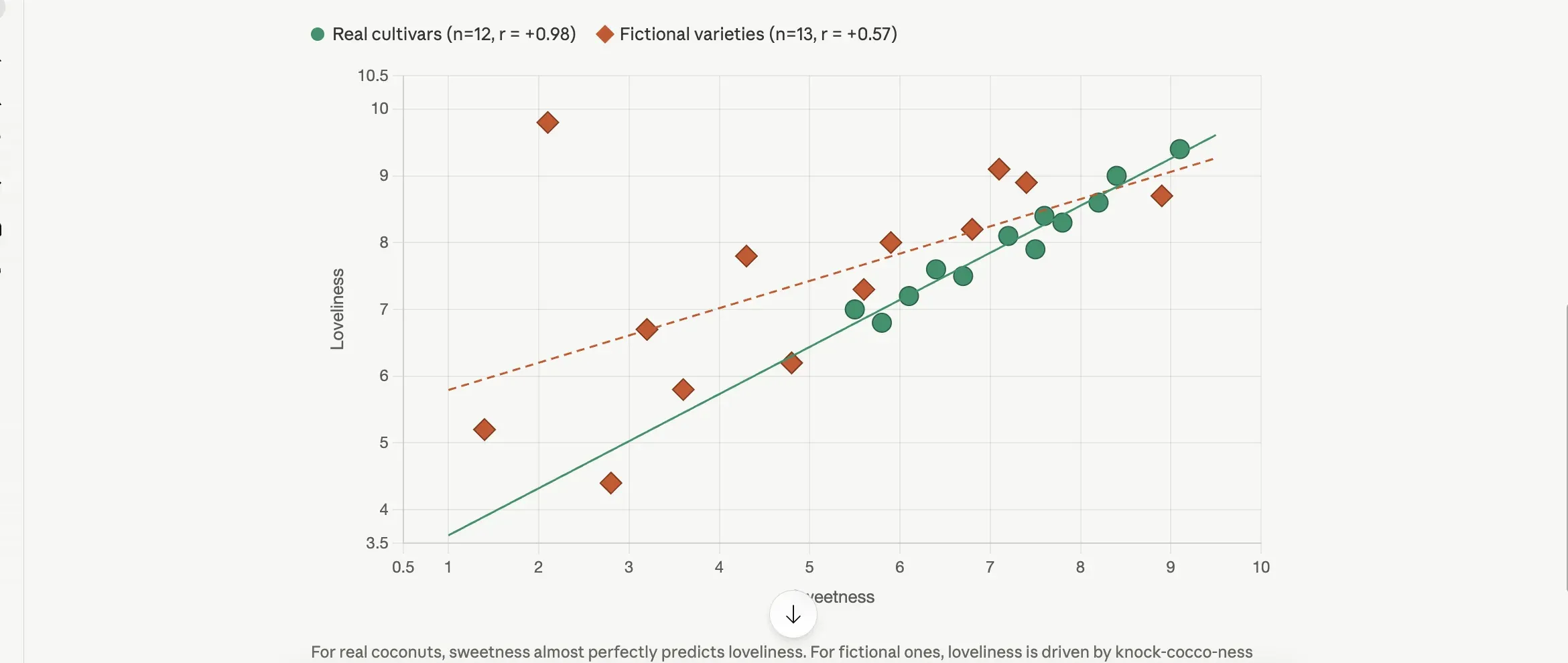 Claude Opus 4.7, fresh chat, no styling instructions. The split-by-origin grouping and the per-group regression lines were the model’s call, not the prompt’s.
I sent this prompt to Claude Opus 4.7, ChatGPT, and Gemini Pro on the same afternoon. None of them produced a boring chart. Claude split the data on the asterisk convention without being asked, drew a regression line through each group, and captioned the result with the correlation coefficient. Gemini titled its chart The Coconut Paradox and labeled four outliers by name on the figure. ChatGPT picked a bubble chart with loveliness as the bubble size and called out Wibbly Twobble as an outlier in its summary. The defaults are good now. If the chart is going to a Slack message or a quick gut check, you can stop here.
Same data, ranked
Here's a dataset of 25 coconut varieties. Make a horizontal bar chart of all 25 varieties ranked by lovely_ness, with bar color indicating whether the origin is real or fictional (asterisked).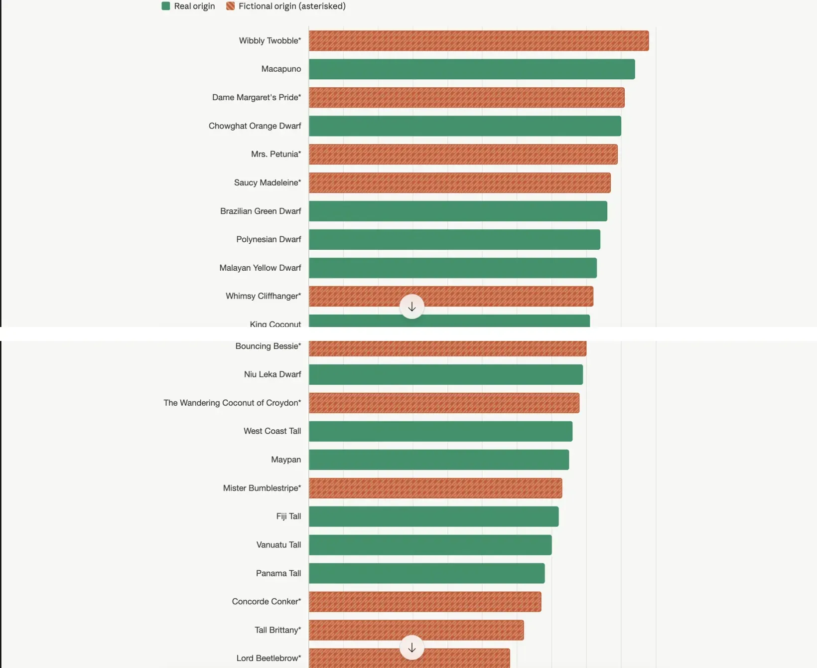 Same dataset, one word changed in the prompt. A scatter shows you a relationship. A ranked bar shows you a hierarchy.
Naming the chart type pushes the model into a different analytic neighborhood. A scatter shows you a relationship; a ranked horizontal bar shows you a hierarchy. The chart Claude produced ranks Wibbly Twobble first (loveliness 9.8) and Spanish Inquisition Surprise last (4.4), with everything else in between, and reading top-to-bottom is doing a different cognitive job than reading a scatter cloud.
The vocabulary that picks the neighborhood: “horizontal bar chart,” “ridgeline plot,” “violin plot,” “heatmap,” “treemap,” “small multiples by [variable]” (small multiples means many small charts of the same shape lined up side by side instead of one big one). The model knows what these are. You’re not teaching it; you’re picking which shelf to pull from. Works across Claude, ChatGPT, and Gemini.
Same data, in a named aesthetic
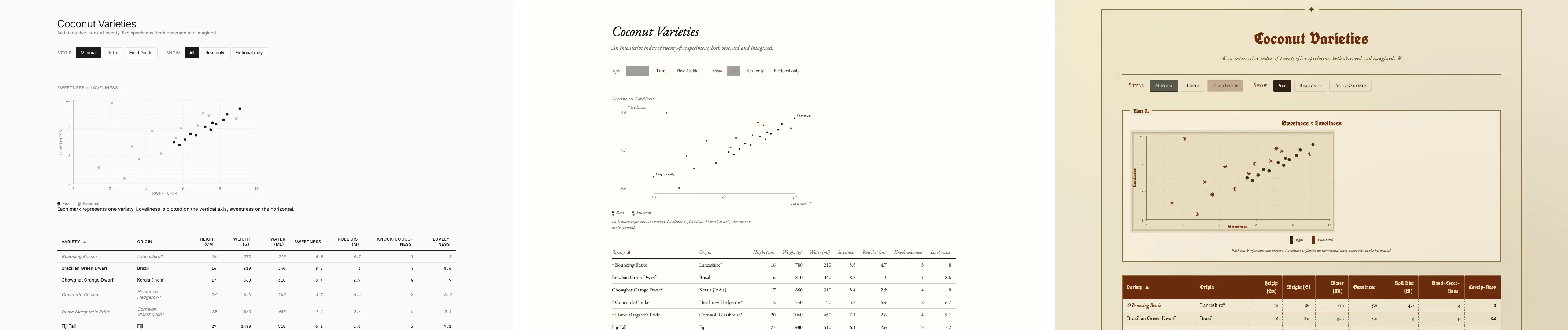
Here's a dataset of 25 coconut varieties. Make a chart in the style of an Edward Tufte editorial spread, with minimal chart junk, muted earth-tone palette, and generous whitespace. Show whatever you think is most interesting.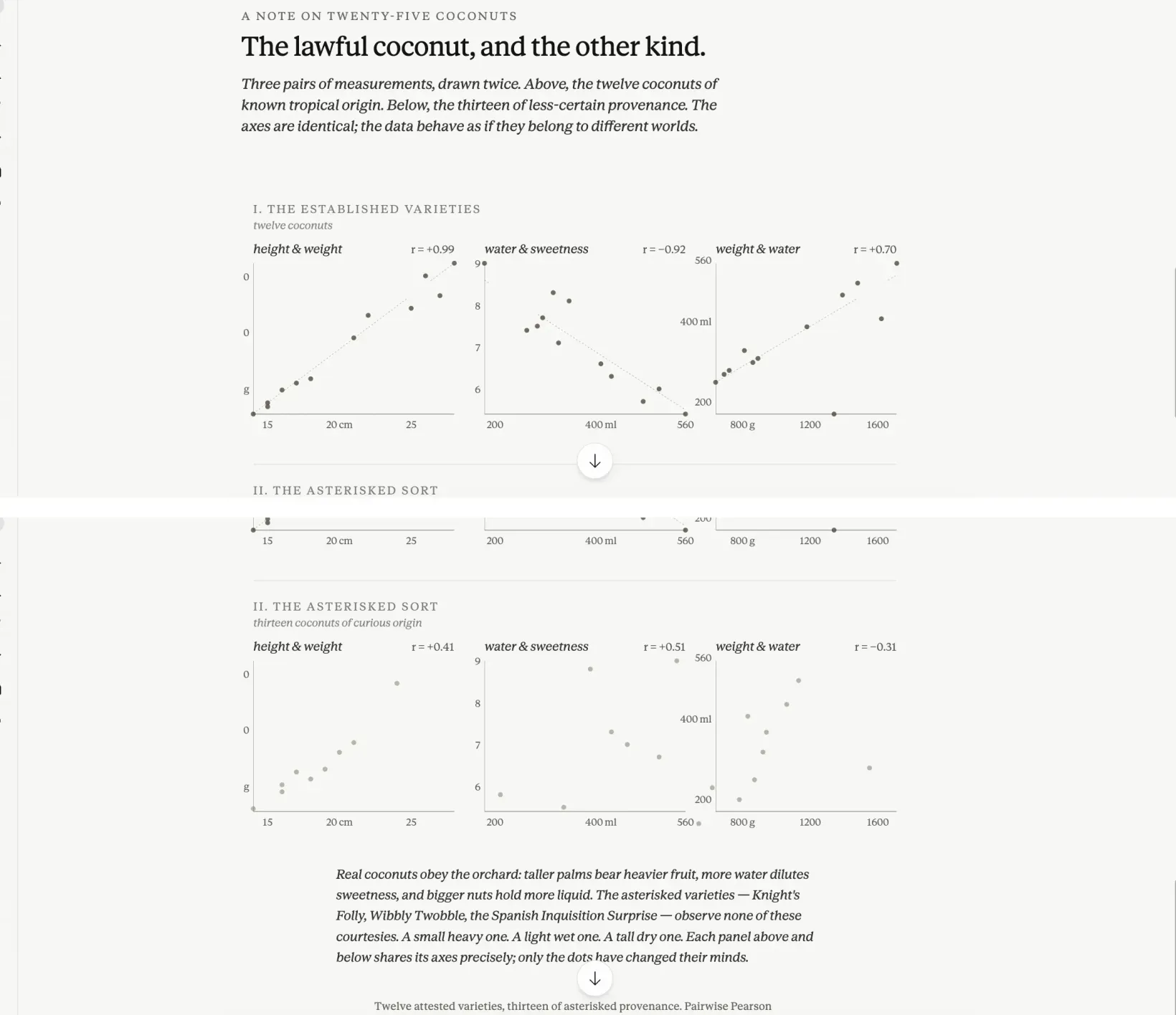 The model leans on the editorial-spread half of the prompt more than the Tufte half. Magazine pacing, not a Tufte chart.
This is the move that surprises people. Designer names work. Era names work. Publication names work. The prompt above is actually two prompts in one outfit. Edward Tufte (the designer known for pared-down, data-focused charts) contributes the data-ink discipline and the small-multiples grid. “Editorial spread” contributes the magazine pacing: the eyebrow, the italic deck, the generous margins, the typography that treats the page as a layout rather than a frame for one chart. What Claude returned leans on the editorial half more than on the analytical half: muted palette, restrained typography, deck-style sub-headlines, small-multiples grid, generous margins. It wasn’t a chart in the usual sense. It was a magazine layout that happened to contain data.
Other aesthetic words that move the output reliably: “1970s data poster,” “blueprint,” “field guide page,” “newsprint,” “isotype” (Otto Neurath’s pictographic chart system). Vague aesthetic words (“clean,” “modern,” “professional”) don’t narrow the visual library enough to matter, so they collapse back to the default. The trick is naming a specific shelf.
Same data, with a finding
Here's a dataset of 25 coconut varieties. Make a chart that shows the relationship between water_ml and sweetness, and call out by name any coconut that breaks the overall trend.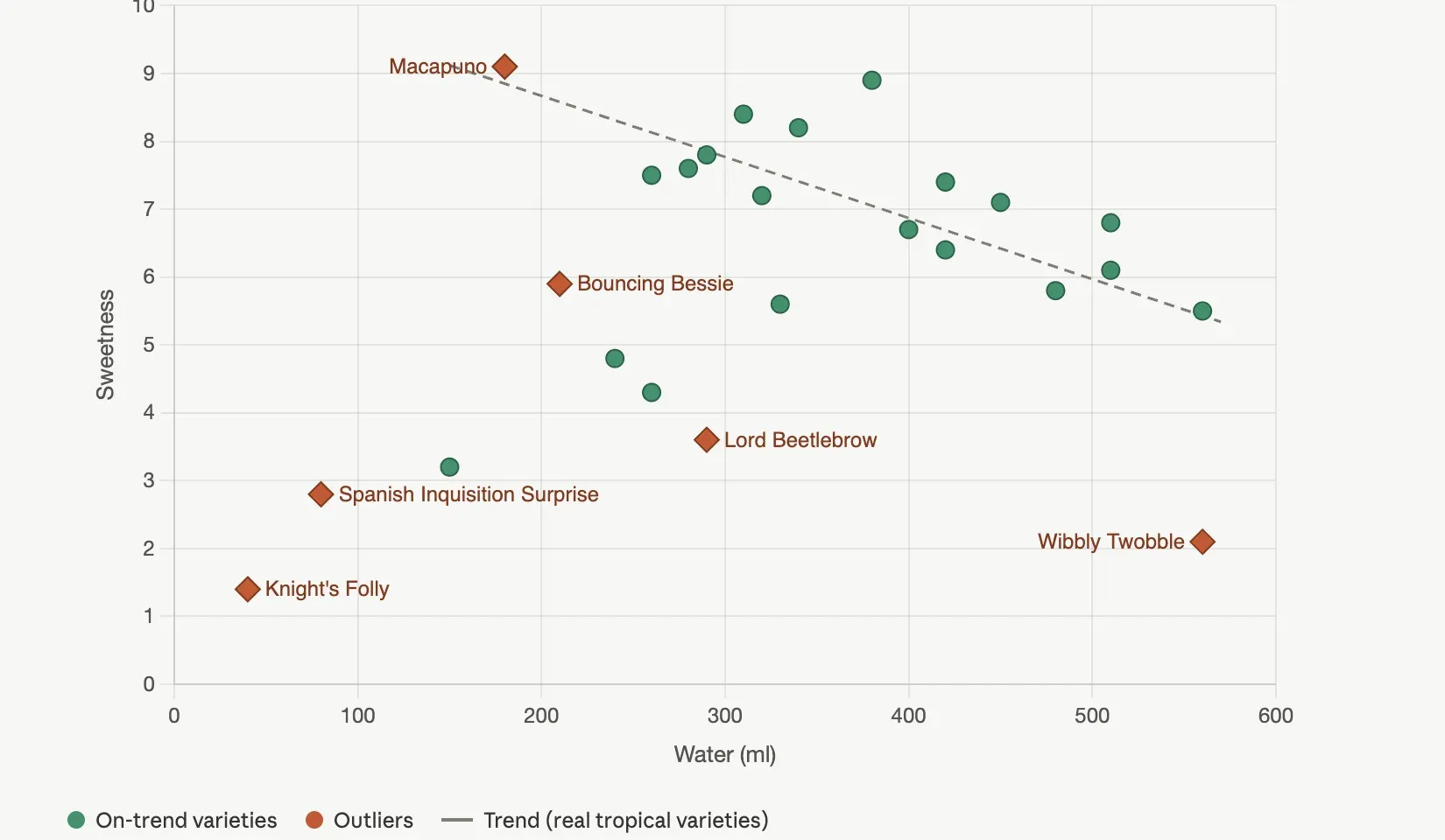 The dashed line fits only the real coconuts. The labels do the analyst’s job: the eye goes to named outliers, not to a scatter cloud.
The earlier prompts told Claude what to make. This one tells it what to say. The dashed line fits only the real coconuts, which Claude inferred without being asked because the fictional ones don’t share the underlying botany and shouldn’t pull the regression. Six outliers are labeled by name, each one a name on the chart instead of a dot in a cloud. The caption no longer describes the axes; it describes the finding.
One honest caveat. The model will sometimes invent a domain explanation in the caption that sounds plausible and isn’t grounded in the data. When Claude wrote the caption for this chart, it offered a botanical reading of the negative correlation between water content and sweetness in the kind of serious horticultural language you’d find in a field guide. The correlation is real (it ran the math). The botanical mechanism is a guess. For internal use, fine. For a slide your boss will quote, verify the explanation against your actual domain knowledge before you ship it.
Same chart, iterated
Refine the chart with these changes: drop the trend lines, drop the legend, much larger axis labels, and annotate Wibbly Twobble and Macapuno directly next to their points on the chart.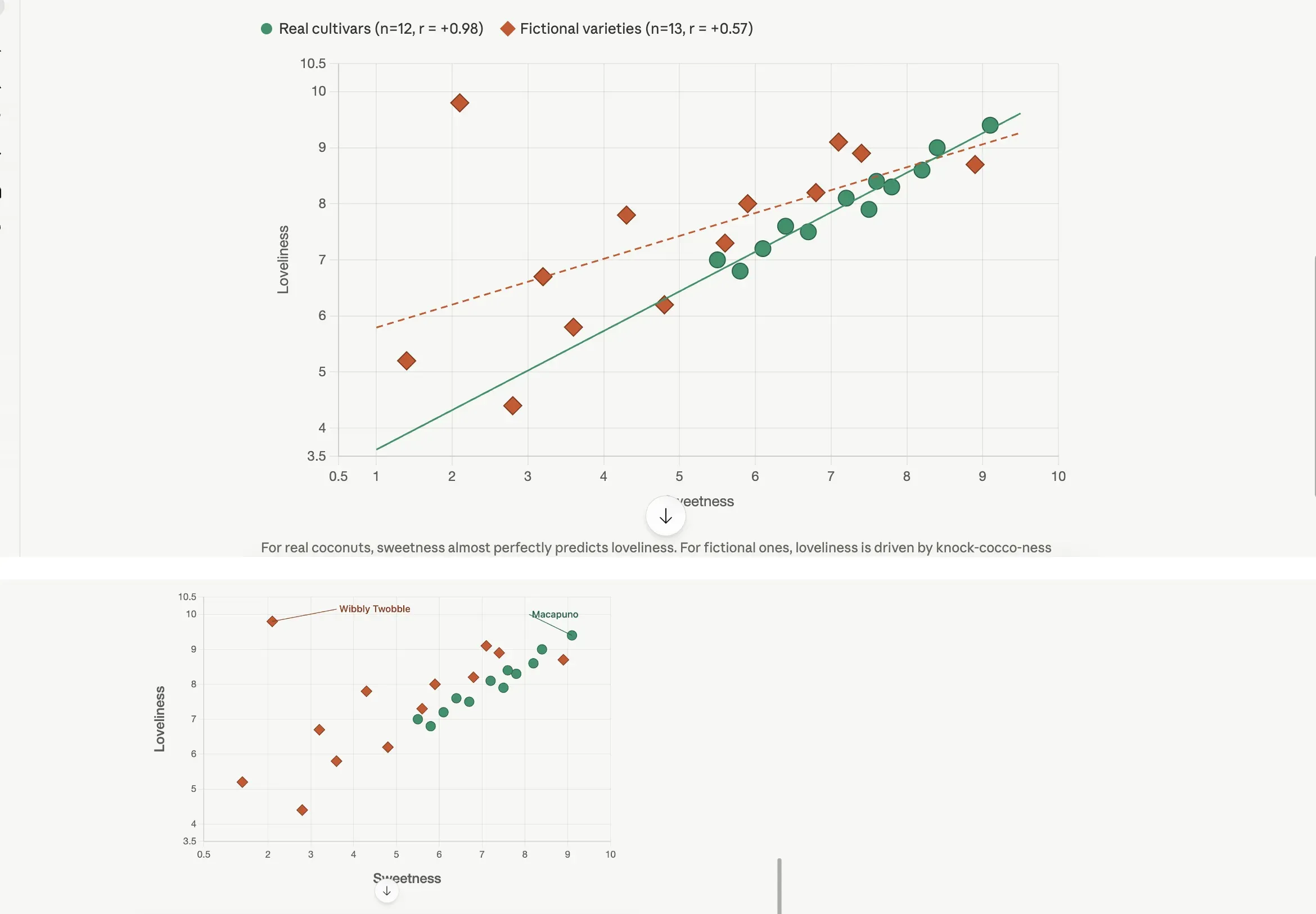 Top: turn one, the default. Bottom: turn three, after one refinement prompt. Most chart polish is subtraction.
The whole move here is realizing you’re allowed to keep going. The chart you got on turn one is a working draft. Turn two refines it. Turn three refines it again. The model holds the chart in context and applies edits one by one. What changes between the default and the iterated version is mostly subtraction: less ink, more breathing room, two named anchors instead of twenty-five anonymous dots. Most chart refinement is removing things, not adding things, and chat models will happily remove things if you tell them which ones.
The iteration vocabulary is the vocabulary you’d use talking to a designer: “less chart junk,” “drop the legend,” “label only the outliers,” “larger axis text,” “swap the palette for muted tones,” “reduce to two decimal places,” “move the legend inside the chart area.” Each one is a single instruction. The model handles a batch of four like the prompt above, but if a batch goes sideways, switch to one edit at a time. The chart from turn three is almost always the chart you actually wanted, and most people stop at turn one.
When the answer is a page, not a chart
A static chart answers one question. Sometimes the audience needs to ask their own questions of the data, which means the right deliverable isn’t a chart at all, it’s an interactive page. Claude artifacts and ChatGPT Canvas both render HTML/CSS/JS that you can use directly in the chat, which means you can ask for a filterable, sortable table with the chart wired to the filters, and the model will build it. A live version of the explorer this prompt produced sits at the interactive coconut explorer, with the same filtering, sorting, and style-toggling you’d get from running the prompt yourself.
 One artifact, three skins. The toggle changes typography, palette, and chart treatment together. A live version is one click away.
The thing to be specific about when you ask for an interactive page is the verbs the user should have. “Make this interactive” gets you something generic. Naming the filters, the sort behaviors, and the style modes (full prompt in the cheat sheet below) is what produces a version worth shipping. Sometimes the answer isn’t a chart or a page either, though, and the next section is what that looks like.
Data presentations that aren’t chart-shaped
The image models that come built into ChatGPT and Gemini will now render legible text inside a generated image, which means a dataset can become a poster, a pictograph, or a card sheet with the actual values printed inside the image. ChatGPT’s Images 2.0 (the model OpenAI calls gpt-image-2 under the hood) is the current standout for this kind of work. The free tier gives you a handful per day; Plus raises the cap; Pro removes the practical limit. The prompts run long because every piece of text the image should contain has to be supplied explicitly, and a re-roll or two is normal before the labels come back spelled correctly.
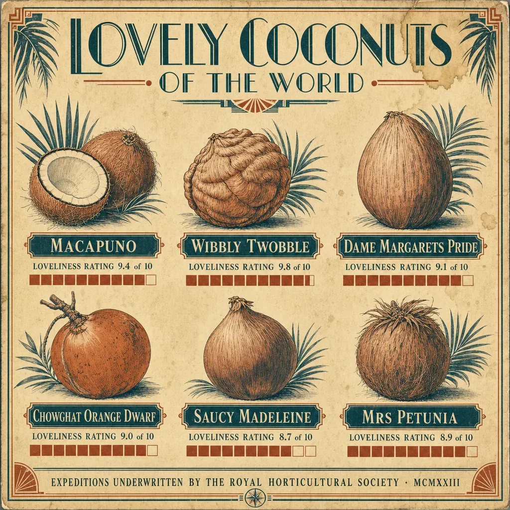 A real bar chart in a 1920s costume. The bars next to each rating are accurate to the dataset.
The expedition poster above is a real bar chart in a 1920s costume. Macapuno’s loveliness rating of 9.4 is plotted as a bar. So is Wibbly Twobble’s 9.8, Mrs Petunia’s 8.9, and the rest of the six varieties shown. The aesthetic is invented (period palette, art-deco typography, geometric ornament), but the data inside the aesthetic is the dataset’s actual numbers.
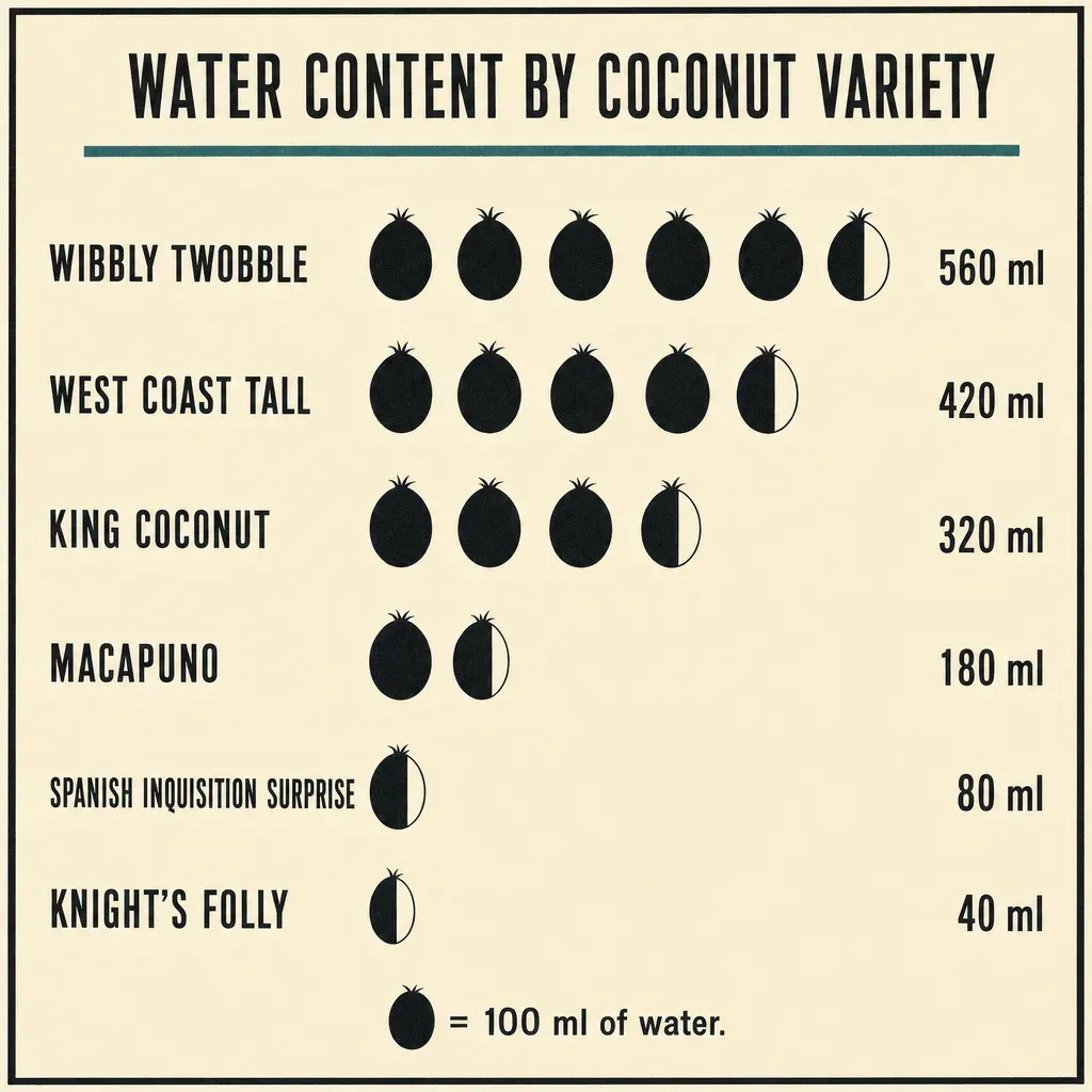 An isotype pictograph for water content, with each icon worth 100 ml. Otto Neurath’s Vienna Method, applied to coconuts.
The pictograph is the same data you would put in a bar chart, except the bars are made of repeated icons. Each icon stands for a unit (here 100 ml of water), and you read the row by counting. Neurath built a whole museum around this device in 1920s Vienna because the count is more legible than a length to readers who aren’t fluent in chart conventions. For datasets where the units are countable things, the pictograph keeps the count visible.
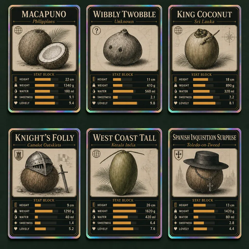 Six coconuts as collector cards. Each card is a five-attribute mini-chart with its stats printed alongside.
The trading-card grid is what happens when you ask the image model to lay out the dataset like a sports-card set. Each card is a tiny dashboard for one variety: name at the top, the five numeric attributes printed in a stat block, and a small horizontal bar next to each stat showing where that value falls in the variety’s possible range. Six cards on one page lets the reader compare attributes across varieties at a glance. The aesthetic is invented (foil borders, slab-serif titles, the photographic flat-lay framing), but the numbers on each card are the dataset’s row for that variety.
These aren’t single charts. They’re layouts where the dataset becomes the structure of a page. Reach for them when the audience needs a feel for the data, or when you want the data to live somewhere that doesn’t look like a chart.
The cheat sheet
When the chart you got isn’t the chart you wanted, the fix is usually one more word. A list of words that work, in roughly the order you’d reach for them:
| You want… | Words that work |
|---|---|
| A different chart type | ”horizontal bar,” “ridgeline plot,” “violin plot,” “heatmap” |
| A different layout | ”small multiples by [variable]” (many small charts of the same shape lined up side by side) |
| A different aesthetic | ”Edward Tufte editorial,” “1970s data poster,” “blueprint,” “field guide page,” “newsprint” |
| An insight, not just data | ”call out the outliers by name,” “draw the trend line only through [subset],” “explain in the caption what changes between X and Y” |
| To iterate on what you got | ”drop the legend,” “less chart junk,” “larger axis labels,” “label only outliers” |
| A different format (interactive page) | “make this an interactive HTML page, filterable by [column] and sortable by clicking column headers” |
| Vintage or handmade | ”1920s expedition diagram,” “1880s naturalist plate,” “letterpress,” “field notebook” |
| A specific palette | ”muted earth tones,” “high-contrast monochrome,” “Wes Anderson,” “three-color risograph” |
| Data-shaped images | ”isotype pictograph with one icon per [unit],” “trading-card sheet, one card per row with a stat block” |
Paste this table into a chat when you don’t know which words to use next, and ask the model to suggest three options from it for the chart you’re looking at. The dataset is still over here if you scrolled down before trying anything: coconut-data.csv.
For more prompts that hold up across the three big chats, see the prompts cheat sheet. For what gpt-image-2 in particular can carry off (including the labeled-diagram capability the trading-card poster section leans on), see past the demo.
Chart captures are real screenshots of Claude Opus 4.7 and ChatGPT outputs. The three data-shaped illustrations were generated with gpt-image-2 from prompts that supplied the dataset numbers directly.